2021 Web Design Trends: Does Your Site Need a Refresh?
- cathtidd
- Mar 19, 2021
- 2 min read

For this blog, I asked my favorite WordPress designer, Laura Bean with Be Digital Marketing, about what's new with web design these days. Website trends definitely evolve from year to year and sometimes it's hard to keep up. Here's what she had to say.
Has your website been updated in the last three years?
It's important to review your site annually and make sure that your website clearly explains what you do, who you help, and why they should choose you.
Here are a few things you need watch out for:
If you are using outdated, stock photos, it's time for a refresh.
Now more than ever websites need to be mobile friendly. That doesn't mean that people can view your website on their phone. It means that it is easy to view and use on a mobile device.
Make sure that you don't have text that is too small or images falling off the page, and you have just as good of an experience on your phone as you do a desktop. (CLICK HERE for an example of a website that is NOT mobile-friendly - it also does not have a current SSL certification.)
Is your website easy to navigate? Or do you put every page you have on your site somewhere on the menu?
Did you think about how the user will use the navigation?
Does your website have an SSL certificate? This is what protects the information that is entered or stored on your website, such as contact forms, applications, shopping carts, intake forms etc.
Look Out for these Website Trends in 2021:
The biggest trend we will see in 2021 is faster sites, less loading times, and better user experience. A lot of that has to do with Google's new algorithm that is coming in May. If you are not hitting the 3 bullets below on your site and you have old SEO practices then your site will be pushed below those who check all 3 boxes.
SSL & Security
Better speed and mobility
Better overall user experience across all devices and platforms:
Site structure
Navigation
Usability
SEO
Accessibility
Here are some examples:
ONE PAGE DESIGN:
This is a very simple one-page design that guides the user, is easy to navigate, and looks great on a mobile phone: https://destinationdentalgroup.com/

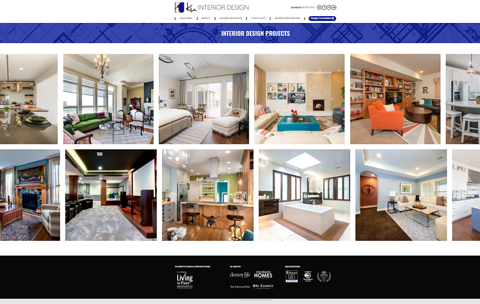
GREAT NAVIGATION:
Ku Interior Design speaks directly to the customer. It's important to note that with large images on the site, it needs a fast hosting plan, along with a CDN (Content Delivery Network).

GREAT BRANDING:
These two coaching sites have branding on point, simple navigation, and the home page does a great job of explaining the key questions:
What you do
Who you help
Why they should choose you


_edited.png)


Comments